Architecture has a user experience (UX), simply because people use buildings and the rooms inside the buildings. That fact tends to get overshadowed by the architecture’s aesthetics: there’s more to see with archticture than there is to actively use, and this using of the architecture easily becomes habitual, escaping our notice.
By extension, there’s a UX for stairs, so naturally there’s good and bad UX for stairs. I came across bad stair UX recently, first hand, when not one but two gentlemen nearly fell all the way down a stairwell at the same time. There were plenty of people around the immediate area that the accident wasn’t as bad as it could’ve been (the gentlemen were uninjured). Part of the reason they fell was because the situation was a little chaotic, so the stairwell use had a bit of a literal stress test, which can bring to light issues that aren’t encountered during normal use.
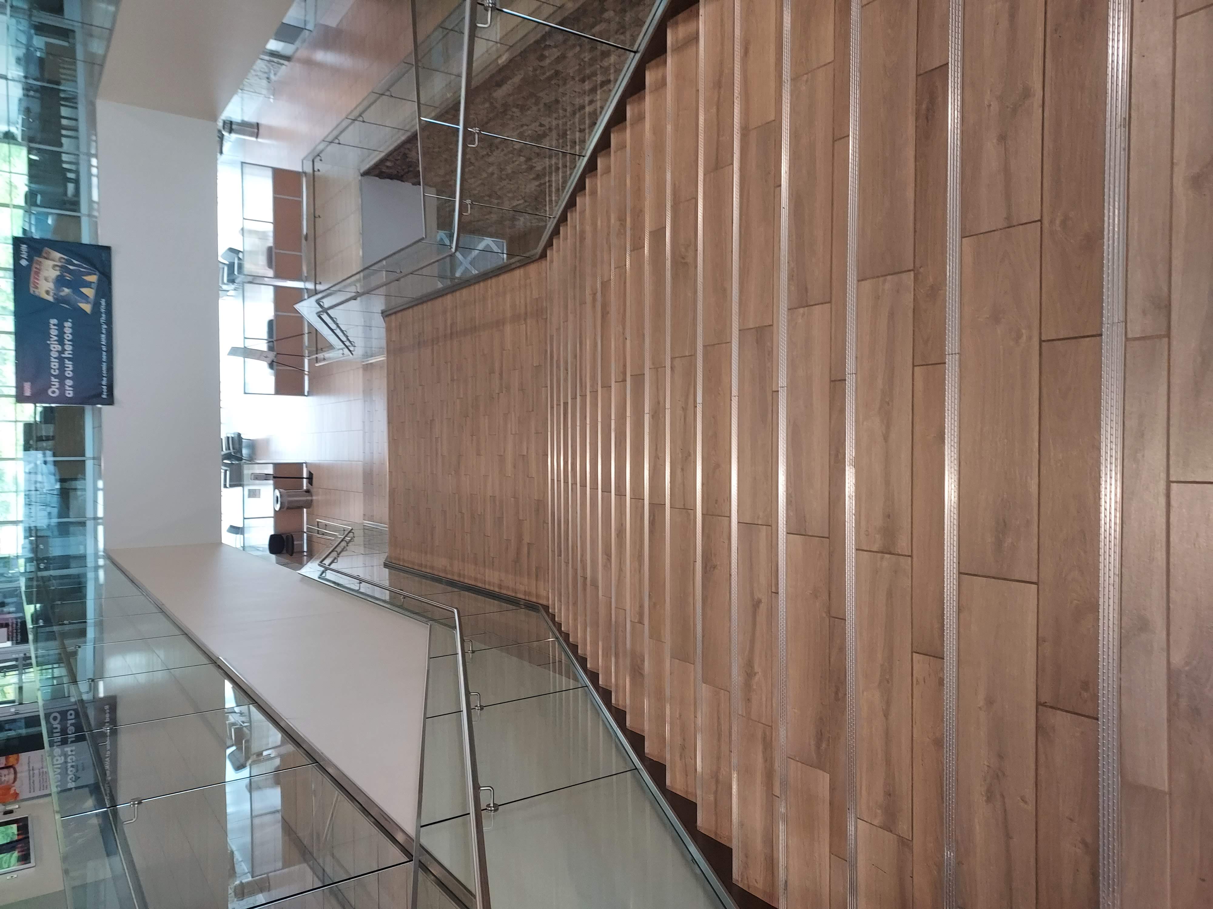
First off, here are the actual stairs where the accident happened:
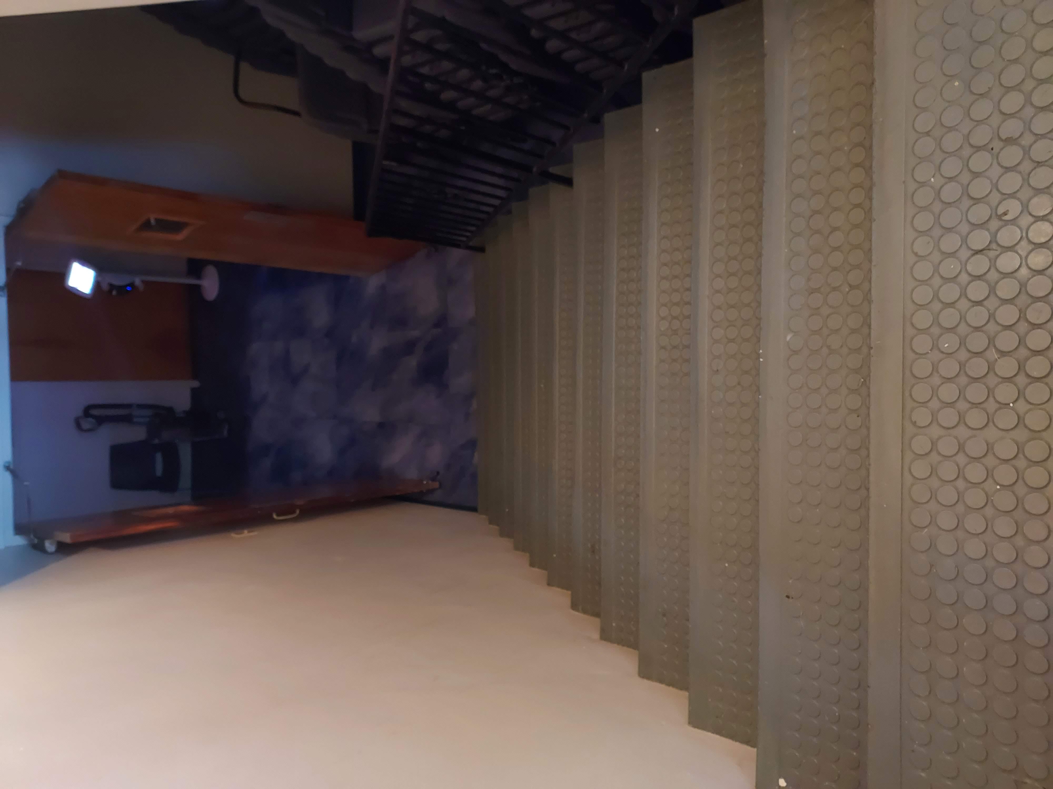
You’ll notice there’s not a great visual contrast between the individual stairs going down, and that contrast is the bread an butter for the brain for navigating stairs properly. It’s hard to see where the stair edges are here. Users (walkers) will have to pay direct attention to the all-important first step to accurately begin descent, increasing cognitive load. The load needed here is also not planned cognitive load, since thinking even briefly about stairs isn’t common, and walking is nearly autonomic. We simply don’t do a whole lot of active thinking to make all of this happen, and we tend to half-assume stable ground when we start the action. Distractions can increase risk.
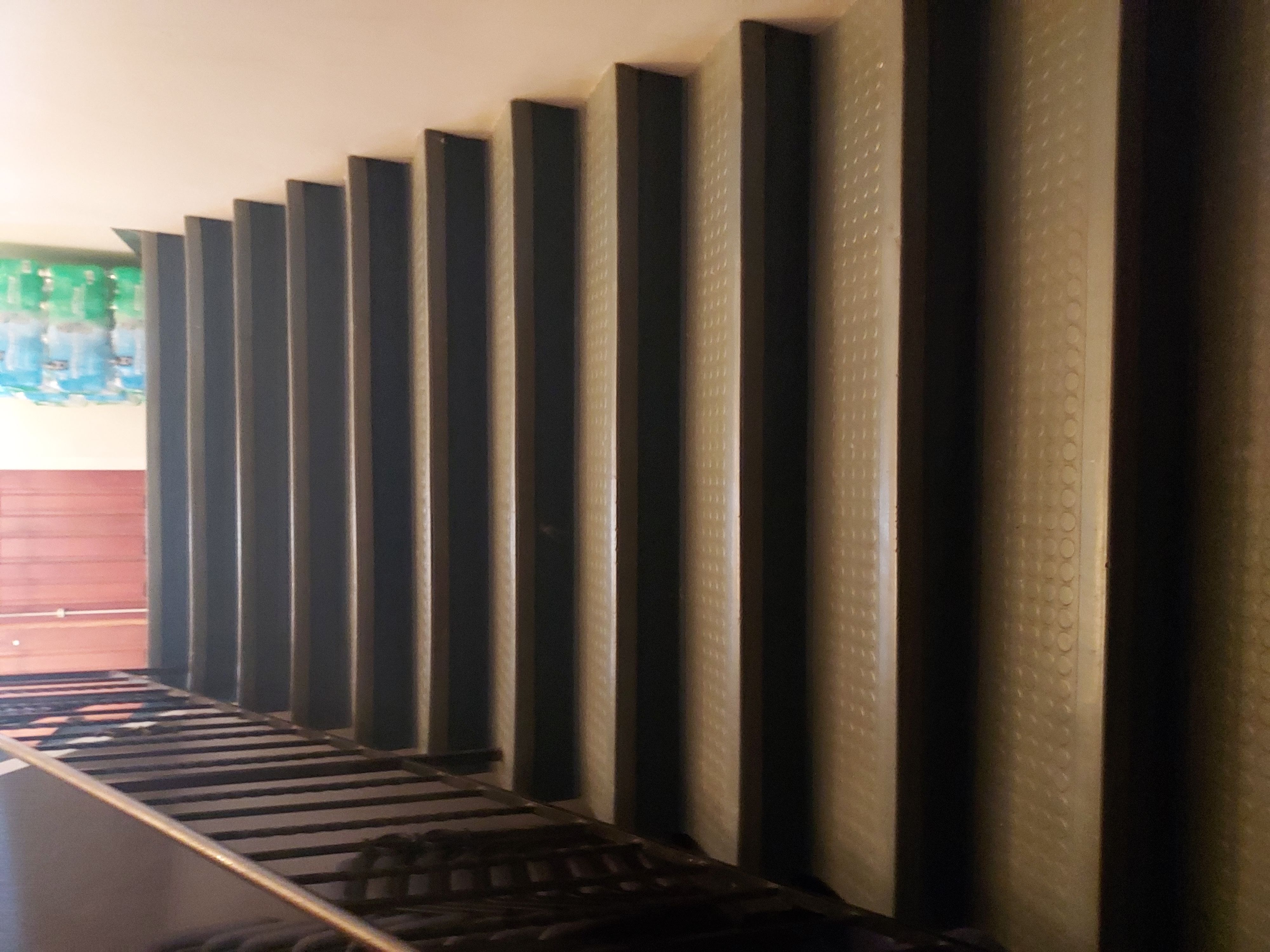
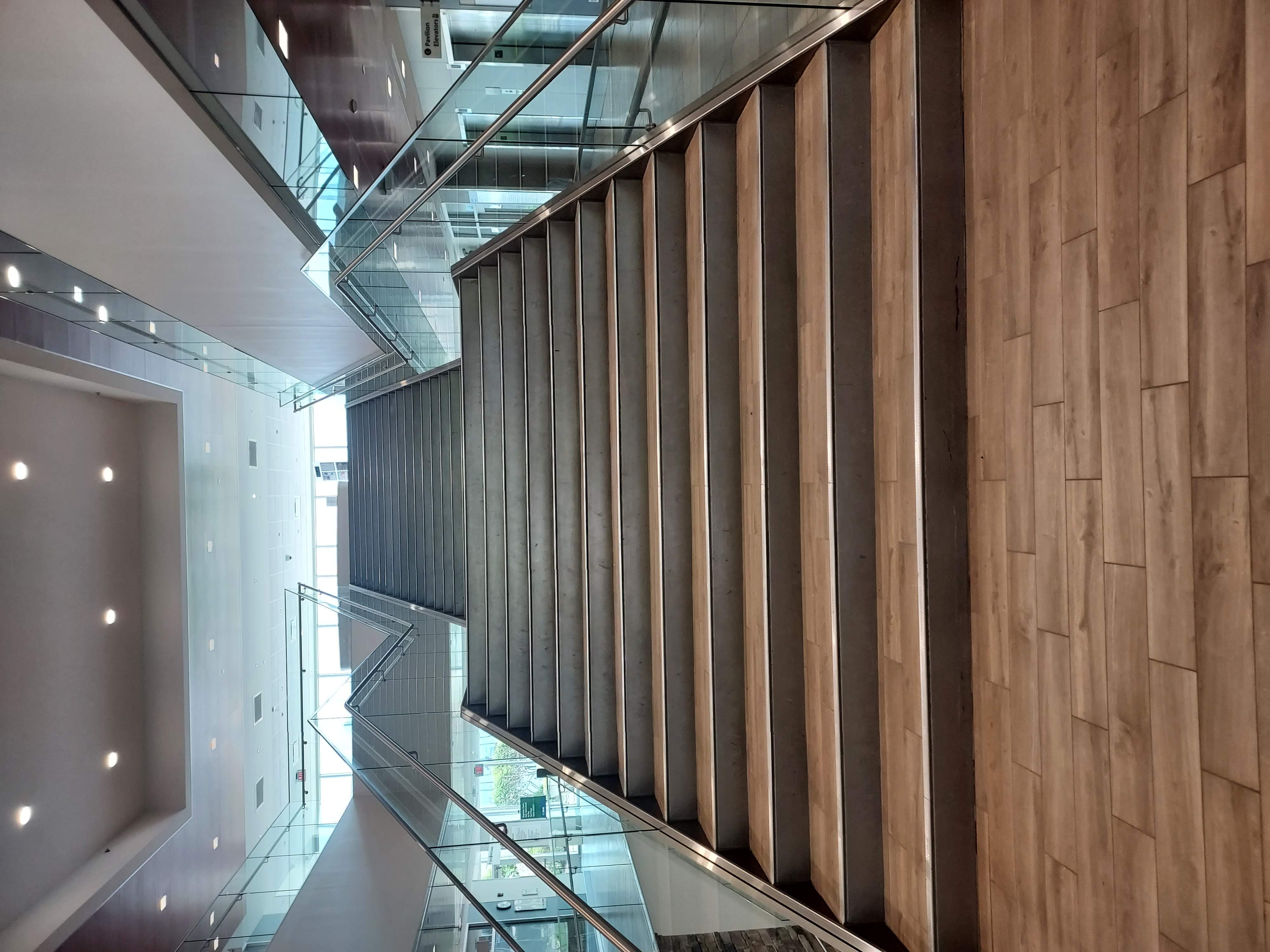
This visual contrast problem can be patched over easily with a strip of contrasting tape, like you see on these stairs:
The tape is almost not needed with those steps because of the shadows cast by the overhead lights, but I always err towards being too explicit if the stakes are high enough, and physical safety is a pretty high stake.
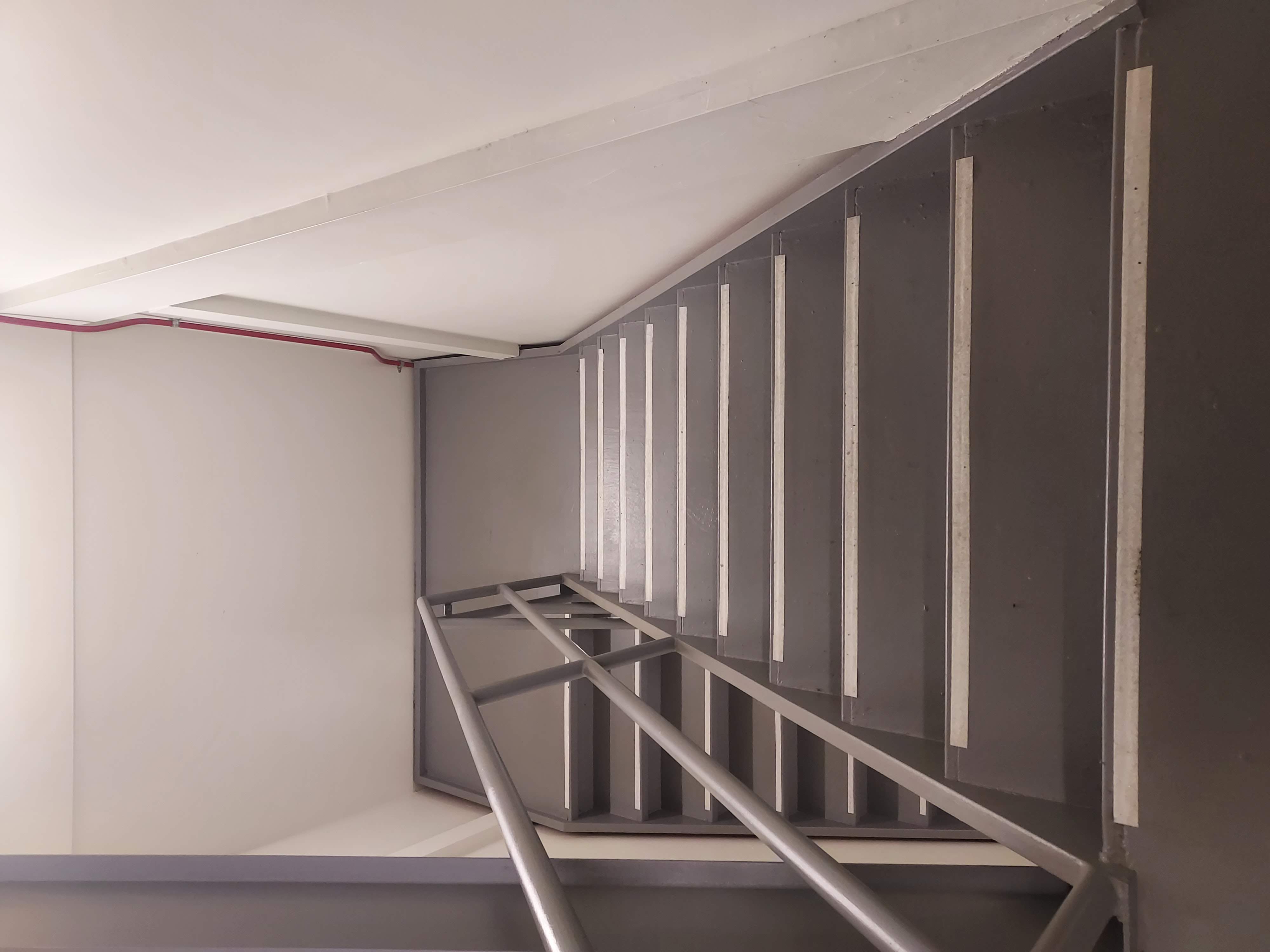
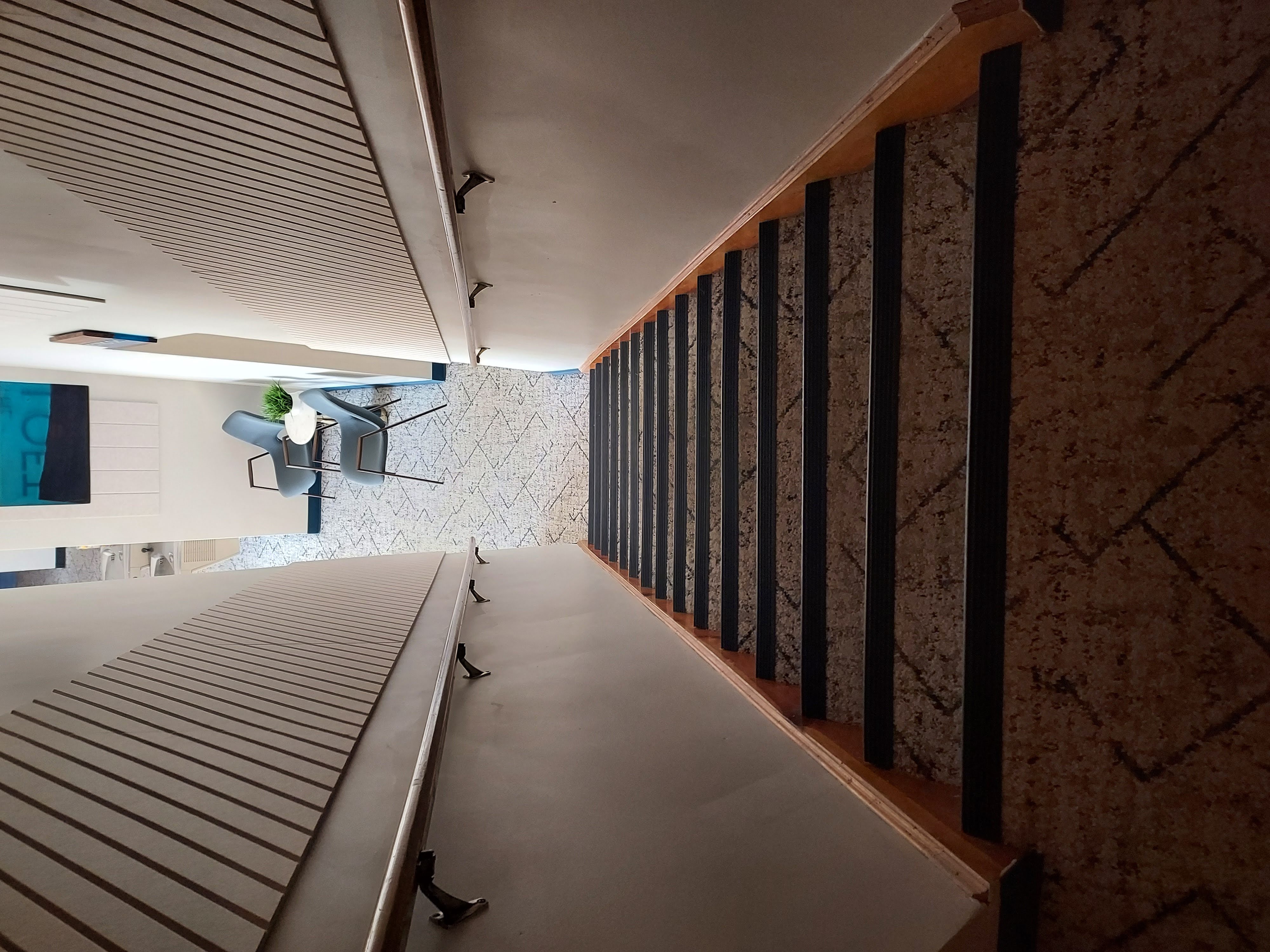
The shining metal edges on these hospital stairs, the “nose trim,” also sharpen and define the stair edges nicely. You can tell from the first photo, looking down, that they’re necessary with the current lighting, which was both natural and artificial (the ceiling was mostly glass). The upwards photo shows contrasting shadows, and so the nose trim is less needed:
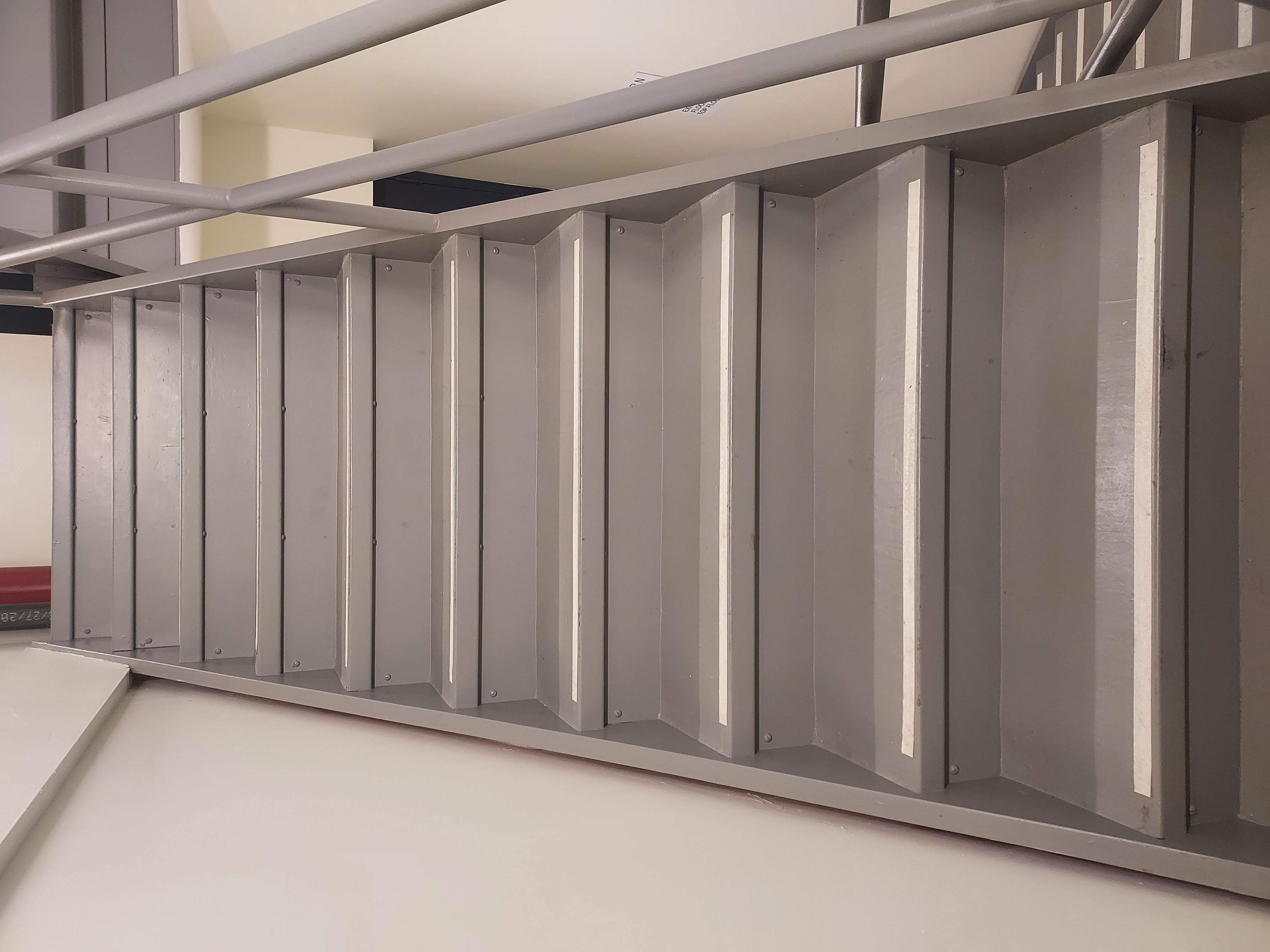
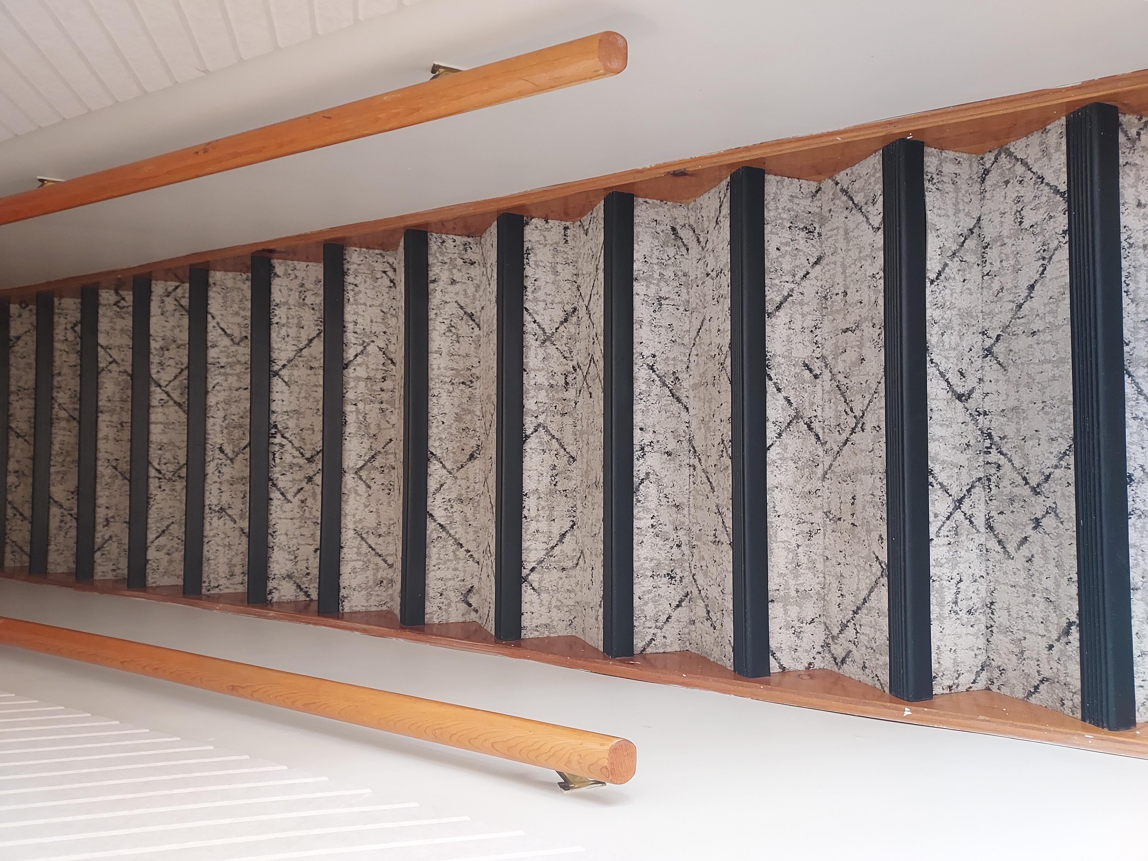
Another good example here. Even in the low light, the descending view has great contrast:
There are scant few writings online that look at stair UX. Here are two, and the second one is a StackExchange question rather than a formal article:
7 Comments
I learned in the military that there are federal standards for both ergonomics and visibility. I recall reading something that mentioned them in military investigation training materials. I’m quite sure they are different in various other federal agencies, because the resulting structures were different enough for me to notice. That kind of guidance is buried in federal bulletins and so forth, and only building contractors and inspectors ever consult them.
I’d be rather surprised if the military standards were similar to other agencies’ standards, since they (the military) are in a class by itself.
I feel like this post could be one of those memes with the guy and girl laying in bed facing away from one another.
Girl – “He’s probably thinking about other girls.”
Guy- “I wonder what the regulations are on stair height and visual contrast.”
Great idea! Stay tuned, brother.
You wouldn’t think stair UX would be this interesting. Your knowledge on the subject is evident in your presentation of the material. Great work!
Hey Jared. Thanks!
Do any of those stairs look familiar? Hah.
They do!