Large parking lots—ones you see for malls and the like—sometimes can having a marking problem. Either there’re no markers, or the markers aren’t as helpful as they can be, which can lead to more user (customer) confusion than if there were no markers.
Here’s how a typical parallel-row parking lot would look with a standard labelling scheme. The “Y” and “Z” on the driving areas are there for discussion purposes:
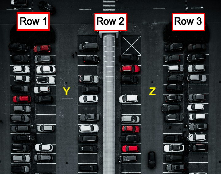
This approach to labeling would work fine if there were one row of vehicles perlabel, but most parking lots have two “subrows” of vehicles. This in itself isn’t a problem if people returning to their cars got to them by walking between the subrows (I’ve seen some parking lots with walkways like that), but people are walking between the main rows, where the Y and Z markers are. Going back to your car, there’s going to be moment where the user has to think about which side of row 2, for instance, they parked on. If they guess wrong, the user will have to squeeze through a of cars to get to the other side of the main row.
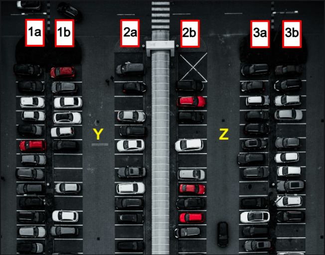
AN easy solution: mark the subrows instead of the main row. That way the user will know if they have to walk down the Y or Z drive path to get to their vehicle.
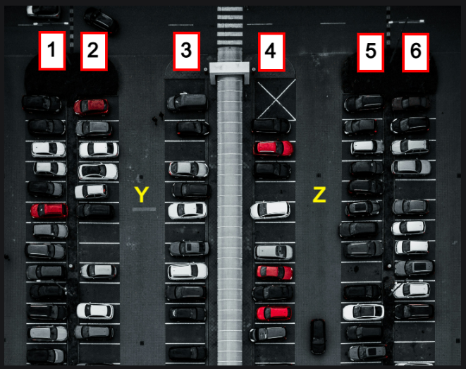
You could also do something like this, but I think it’s overkill. Two characters leans more into recall instead of recognition, which adds to the cognitive load. Using just numbers give the rows enough of a sensible order:
I thought about adding different colors to the rows or subrows, but that also feels needlessly complicated. Betters solutions would emerge through a user survey or testing. User experience design may have a reputation of being artsy-fartsy, but a good UX has scientific backing. Instead of testing physical laws, you’re testing human behavior and preference. Make a good guess, design a prototype, see what works and doesn’t work, and then improve the design.
Parking lot photo by @stefzn on Unsplash.
4 Comments
There is a whole class of engineering for parking lots. The biggest problem with 90° slots is the increased likelihood of mishaps (fender-benders and door dings). This is made worse by insufficient passing space for two directions of flow. 60° slots are safer and forced single direction flow is far safer. While there is the inevitable problem with drivers oblivious or hostile to such restrictions (a common complaint with Walmart shoppers), in the long run you have fewer mishaps. It’s also easier to remember where you parked when the rows point alternate directions.
I learned this stuff while serving in the Military Police.
I didn’t look up anything about parking lot engineering, but what you’re saying makes intuitive design sense to me, especially the alternating row/memory.
I do like the 60 degree design. There’s a few parking lots here that do that, one of them a Wal-mart. Do you think they’re not as common because of the one-way restriction? They feel like a less cumbersome use of space but there’s always a trade-off.
The reason the angled parking is not more common is because the other way is considered more space-efficient. You can get more cars in square lots. I can assure you that it’s rare to find squared lots full, so I’m not sure why the obsession with maximizing space is still a major thing.
There might be some laws about the maximum number of spaces you need, relative to the max capacity of the stores? Something like that. The only time I’ve ever seen a parking lot full is if there’s like an event nearby. Otherwise, at most they are 3/4 full, if even that much.